 |
| b l o g | |
21.5.07Round-UpMost will know that (possibly excepting Quisp) Diet Pepsi is, to me, the greatest household chemical ever sold, the product I am most loyal to, and, to the degree to which such is generally possible, a product style icon. Also fantastic, delicious, or satisfying, or whatever it is.
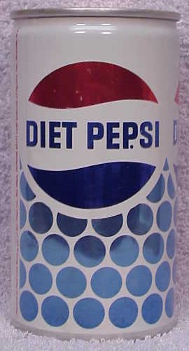
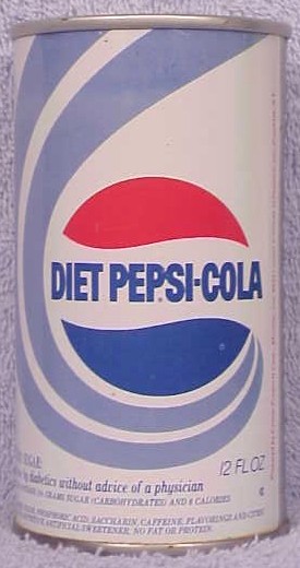
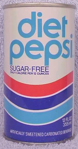
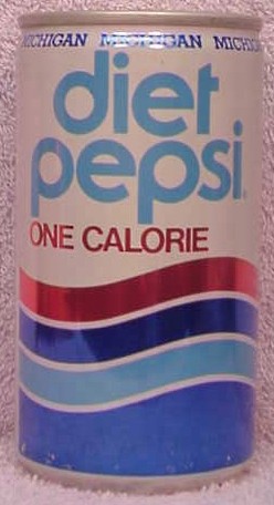
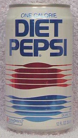
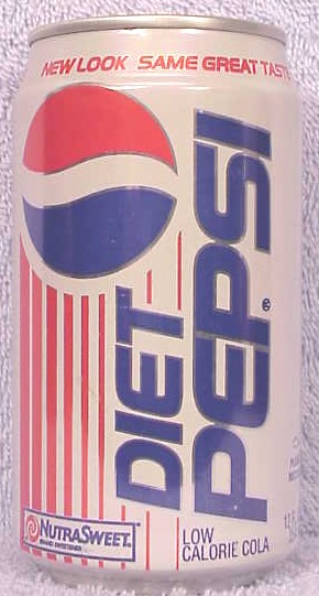
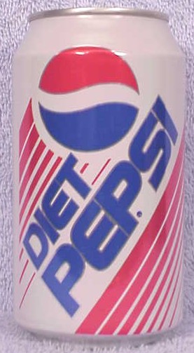
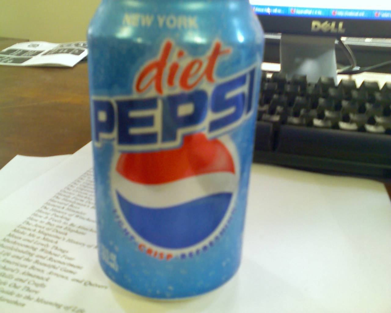
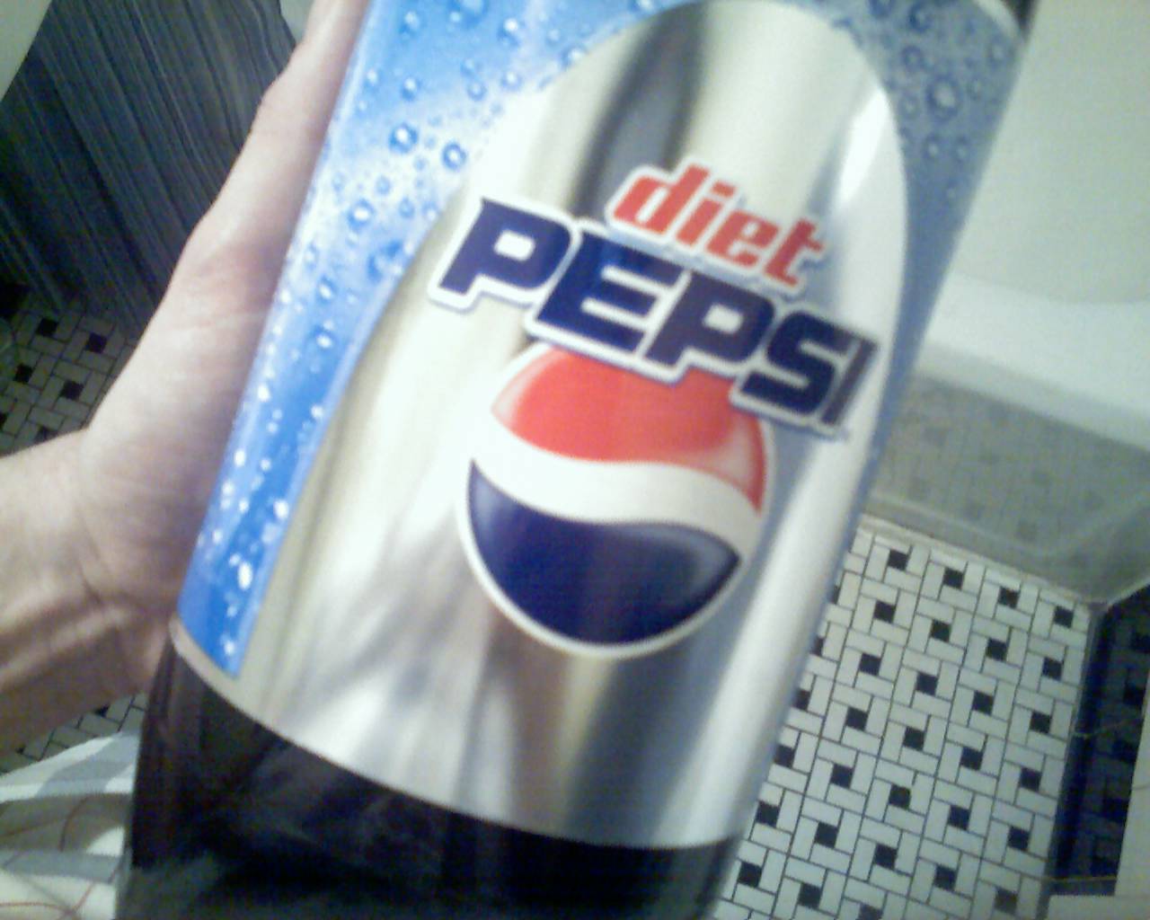
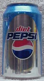
Unlike a certain other diet cola, the design kit for which has always looked vaguely like something a little precious pulled, all eyes twinkling, from a desk drawer in Father Americana's den, Diet Pepsi has throughout its history (until at least 1996) managed to sell itself as precisely what it was: something artificial, effete, a bit modish, possibly addictive. This was perfect. Witness the designs from 1964, 1968 (note the health bulletin on this can), 1975, 1983, 1986, 1991, and 1994. (The 'Uh Huh' period and designs with squiggly, cheery fonts are not to be lauded, admittedly.) The 2002 design was not the best, certainly. It was a little too huggy, eye-level friendly; it emanated exactly from the middle of the brow. But at least it was consistent: foamy, blue, and harmless. The new design is simply horrible. I am not jerking my knees here. The recent re-design of the Guardian Unlimited, for instance, left me cool (in tears) at first, but I understood why it happened (you know, practical reasons) and so did not grieve. I believe I'm perfectly happy now. The 2007 Diet Pepsi design team, I imagine, would have you believe we ought to celebrate (in a world without articles) 'New Look, Same Great Taste!' (which phrase is pillaged from the trade dress of the Diet Pepsi of the early 1990s). The taste is, of course, the same, and above reproach. And the look is nearly the same, too, but inexplicably altered, worse, and, of course, changed for no practical reason. The blue, bubbly background remains, more or less, and the main font has been homogenized for the best, but a puzzling, gaze-stealing silver arch now frames the product name and covers half the label front. We are not happy. Free-associating, I come up with a list of emptinesses this arch conjures in my mind. Locomotive tunnel. Viaduct support. Grotto. Frightening, tree-bowered country lane. Mine. Sconce. Chapel entrance. Strip-club spot-light. Beam from a hostile alien spacecraft. Missile trajectory. Hood. Toenail. Bubbles and vaults? Closed and open? An arch on a cylinder? Photographic background, holographic fakery? The design is obtrusive, which it has never been. (But perfect for the corner billboard at 45th and Broadway. More on this soon.) Someone decided that mere newness was important to the market, and attractive. Why try to be both a swill and a lifestyle choice? Why forget your particular strengths? The old motto, 'Light. Crisp. Refreshing,' is gone. It has not been replaced by 'Incoherent. Gauche. Shiny,' as it might have been. At least a year (probably more) will have been wasted before things are put right. * * * Do any McDonald's in New York sell soup? Or hot dogs? |
|
| Home Erik Kennedy Friends Erik Kennedy Archives current 2016 2015 2014 2013 2012 2011 2010 2009 2008 2007 2006 2005 2004 |
|